When 10 million learners feel lost, the app is the problem.
A redesign of Babbel, the world's top-selling language app, turning confusion into confidence, one screen at a time.
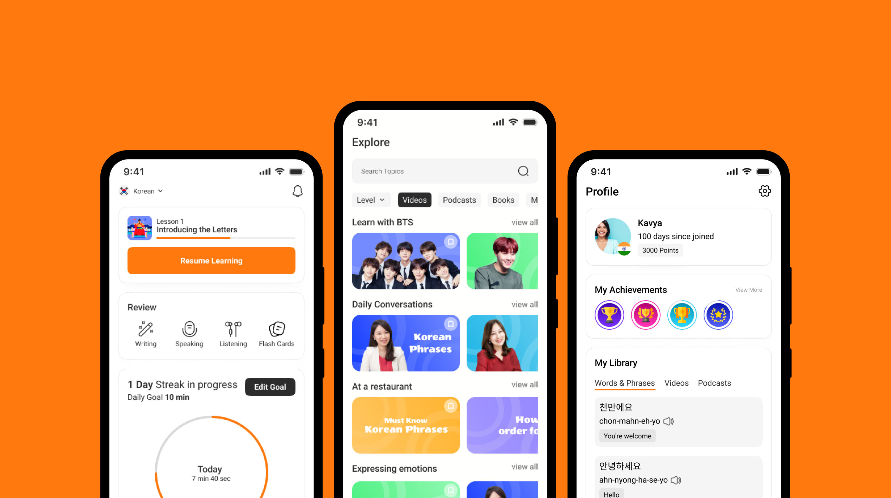
Babbel had the brains. It just didn't have the soul.
Babbel's content was world-class, interactive lessons, speech recognition, podcasts, games. Almost every user improved their grammar and vocabulary, and around 60% even improved their speaking skills.
But the app itself? It was getting in its own way. Users weren't failing at learning, they were failing at using. And in a market where Duolingo makes everything feel like a game, "effective but frustrating" doesn't survive.
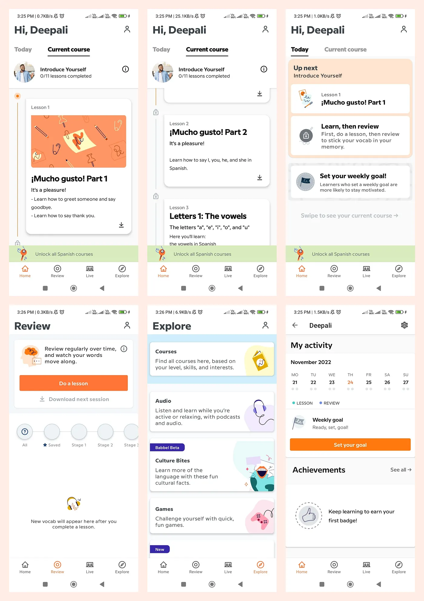
The existing app, captured across six screens. Effective content, but the experience didn't carry it.
I didn't just study the app, I became the user.
I used Babbel daily, read hundreds of Play Store reviews, ran competitive analyses against Duolingo, Rosetta Stone and Memrise, and mapped every friction point in the user journey.
- 01Personal app usage & observation
- 02Play Store review mining, 500+ reviews
- 03Competitive analysis, four major competitors
- 04Desk research on language-learning outcomes
- 05Information architecture mapping
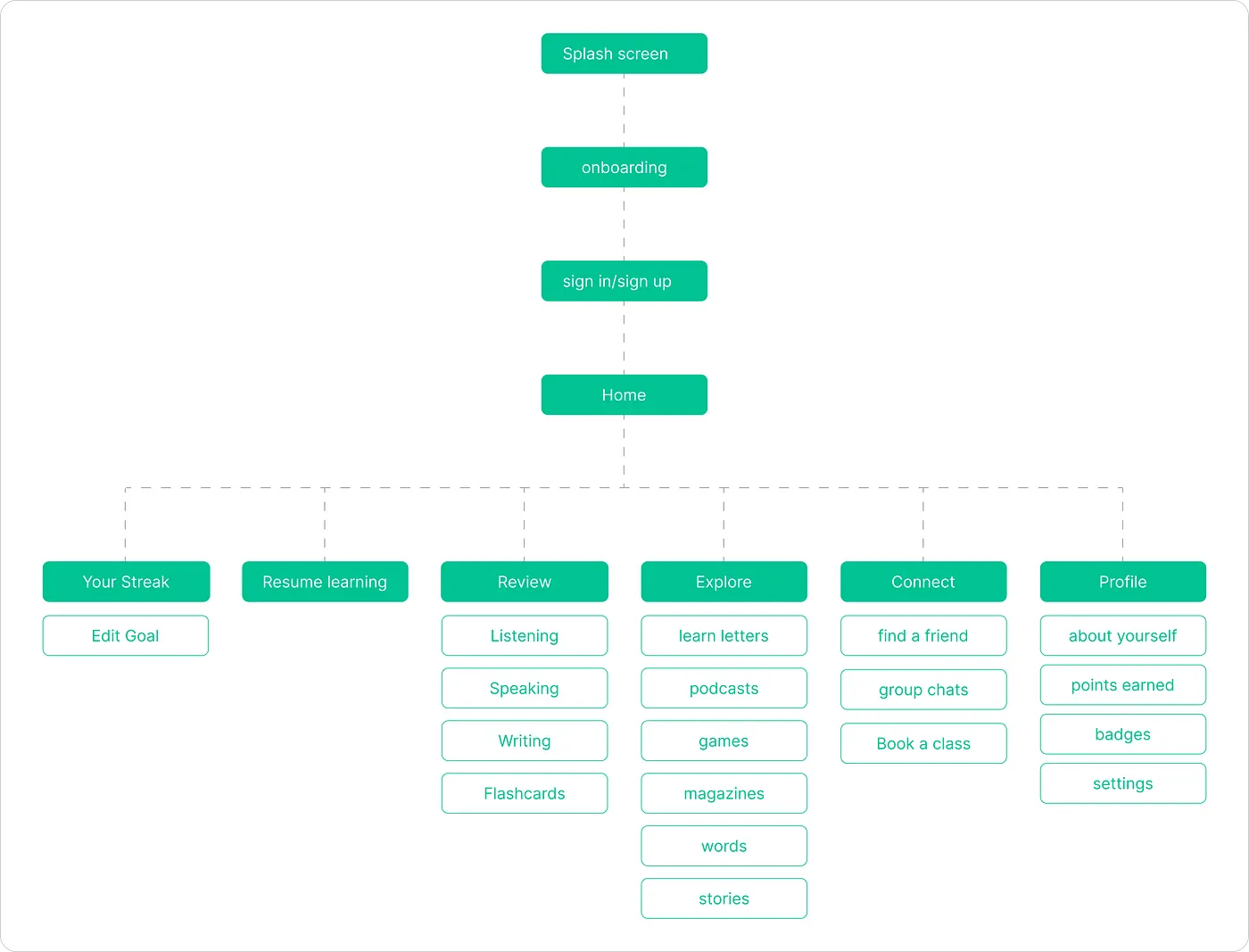
Rebuilt the information architecture from the ground up. Six clear paths from home, not six dead ends.
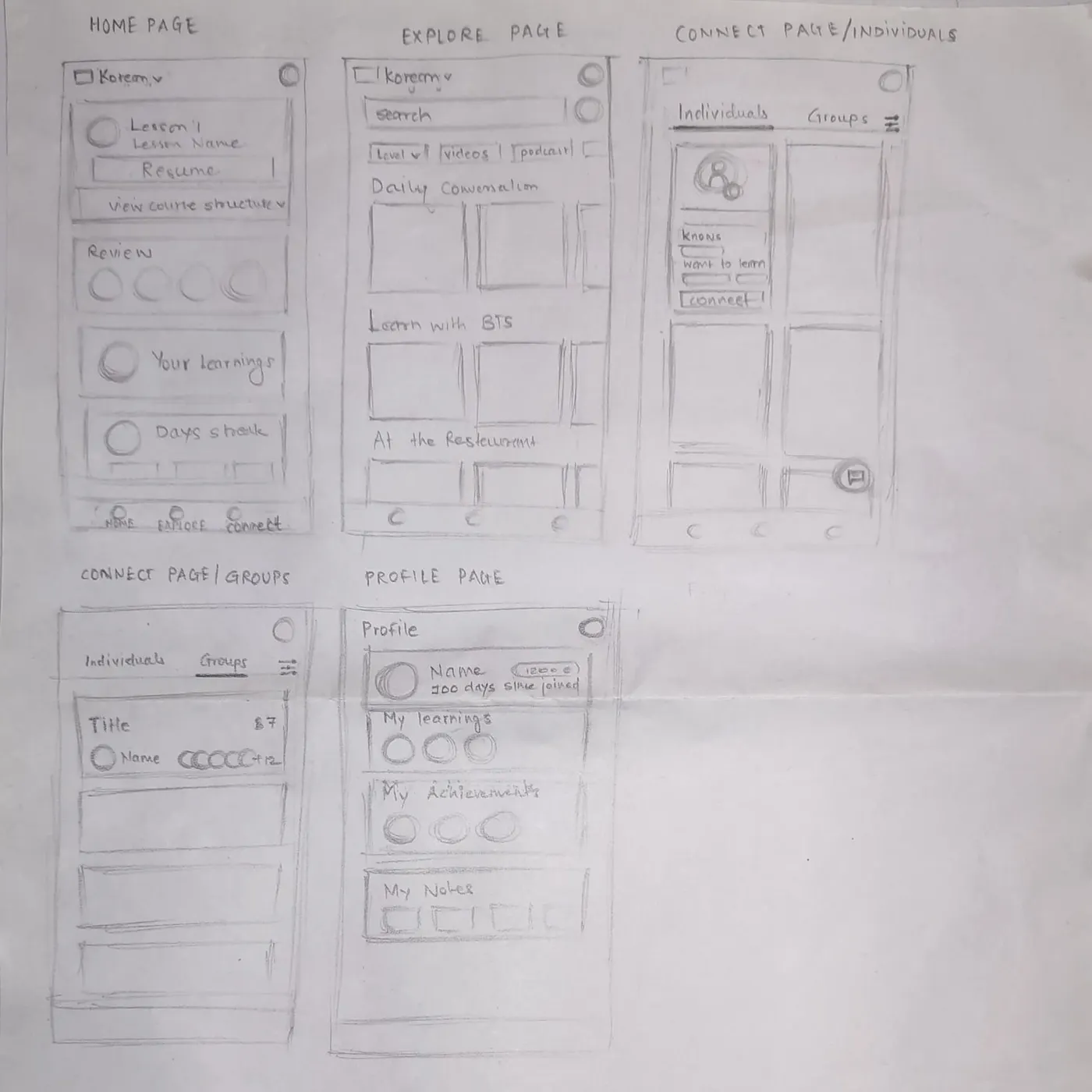
Pencil-first. Sketching every primary screen before opening Figma kept the ideas loose and the decisions cheap.
Six fractures in the experience.
Each one small enough to ignore. Together? A death spiral of frustration.
Lost in Navigation
Users couldn't find their way. Menus were buried, flows were broken.
Visual Chaos
Inconsistent UI with no visual hierarchy. Nothing guided the eye.
The Screenshot Hack
Users took screenshots to review answers later. The app didn't let them.
No Fluency Path
Grammar improved, but speaking? Users were on their own.
Invisible Progress
No word tracking. No milestones. Users couldn't see how far they'd come.
Buried Controls
Switching languages meant diving into settings. Every. Single. Time.
Not a facelift. A rethink.
Every screen was rebuilt from first principles: What does the user need right now? What's getting in their way? What would make them come back tomorrow?
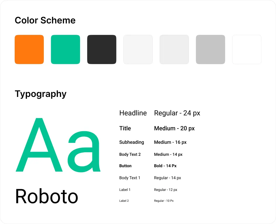
A tightened visual system. Orange to act, emerald to confirm, Roboto across a calm eight-step scale.
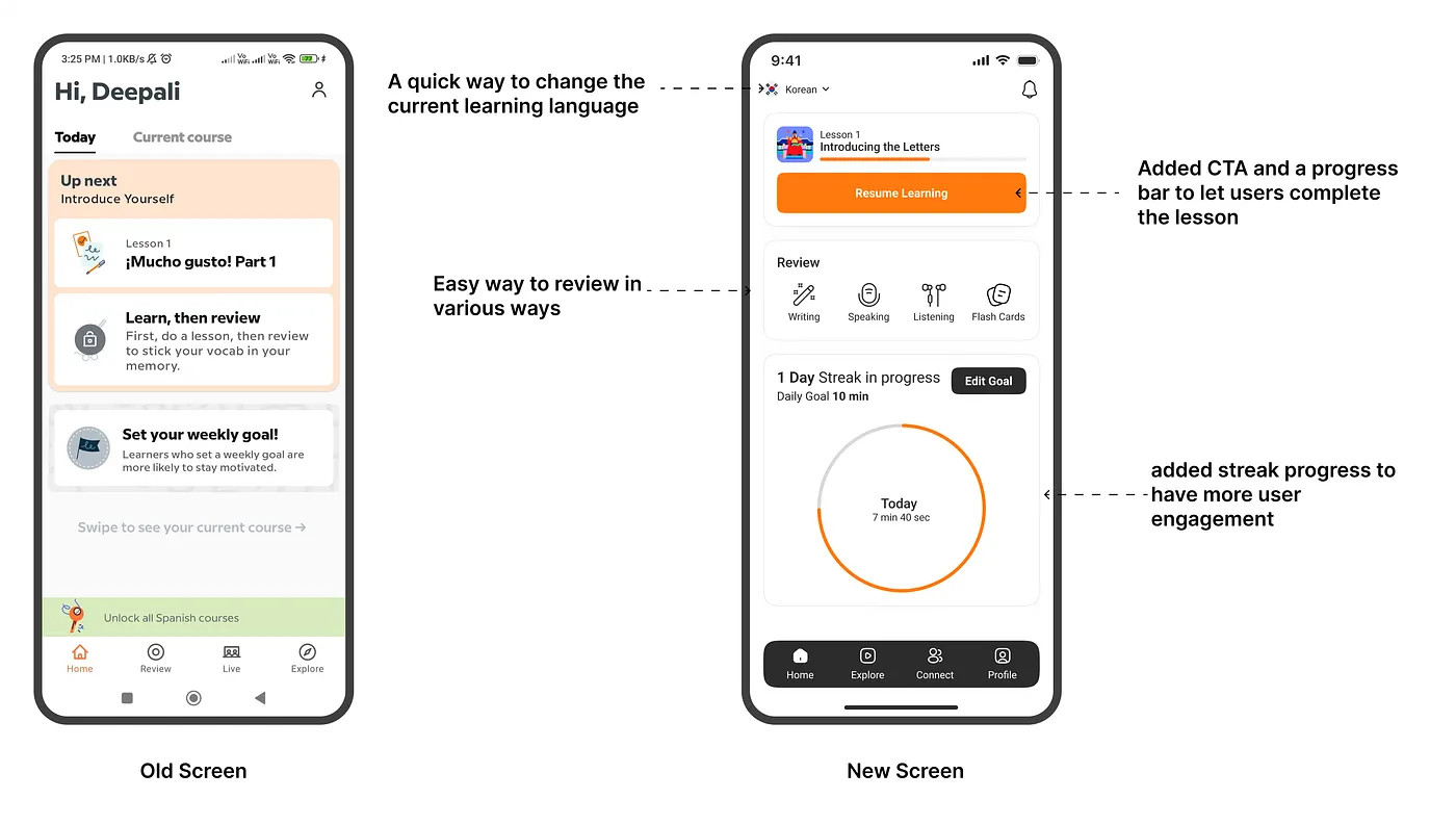
Home, before and after. A clear next step, four review modes, and a streak that actually shows up.
The Zeigarnik Hook
A progress bar that whispers "you're almost there." Streak counters that turn learning into a daily ritual. Psychology meets pixels.
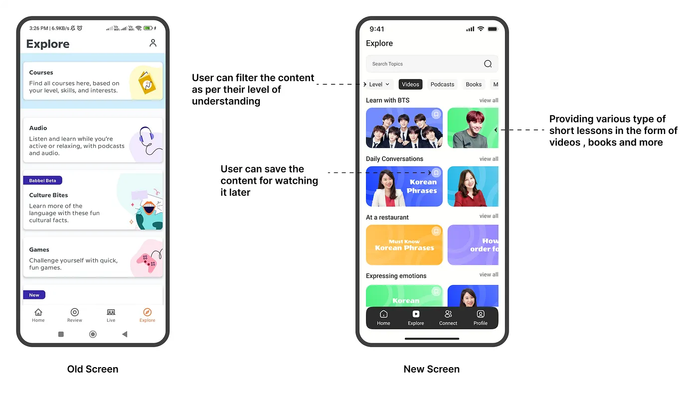
Explore, restructured around what users actually browse for. Filter, save, return.
Content you actually want
Podcasts, articles, games, categorized by what you love, not what we think you should learn. Your interests become your curriculum.
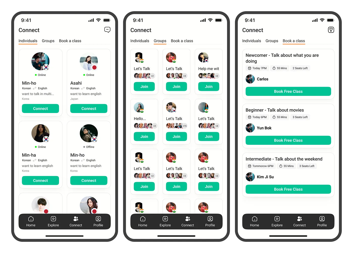
A new Connect tab. 1:1, groups, or booked classes — three ways to actually speak the language.
The missing piece
Chat with native speakers 1-on-1 or in groups. Because fluency doesn't happen in isolation, it happens in conversation.
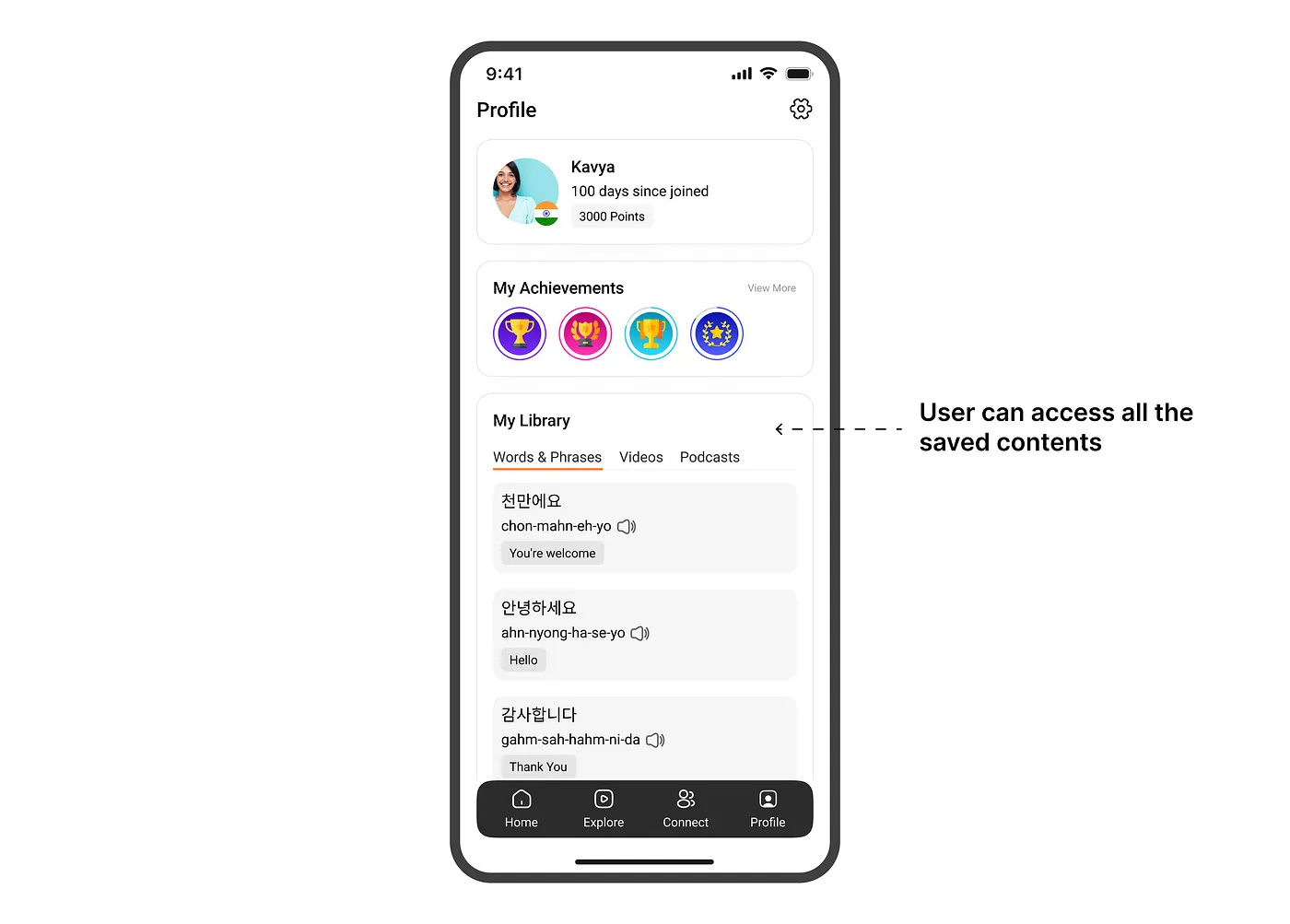
Profile turned into a personal library — every saved word, badge, and podcast in one place.
Your learning DNA
Every saved word, every bookmarked lesson, every milestone, organized beautifully. Your journey, at a glance.
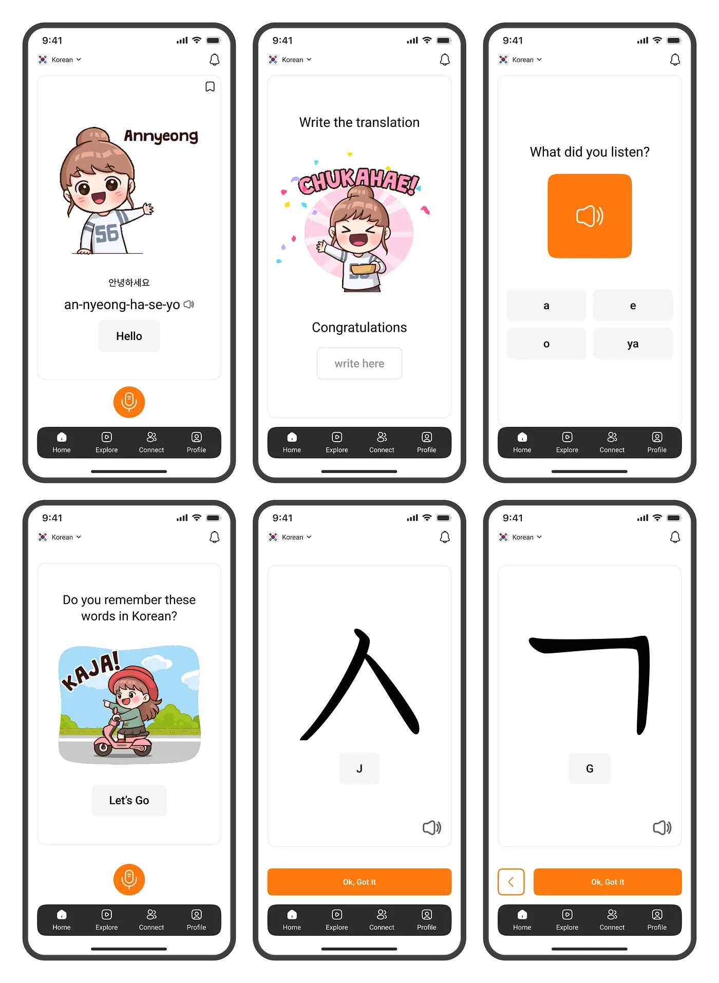
The redesigned learning flow, end to end. Clear cues, playful celebration, and one consistent visual language.
Lessons that shaped how I design.
"UX isn't about features, it's about confidence."
Every interaction should make users feel smarter, not smaller.
"Users don't drop off because they're lazy. They drop off because they're lost."
Navigation isn't just wayfinding, it's the foundation of trust.
"The best UX gets out of your way and helps you feel smart."
Invisible design is the hardest, and most impactful, kind.